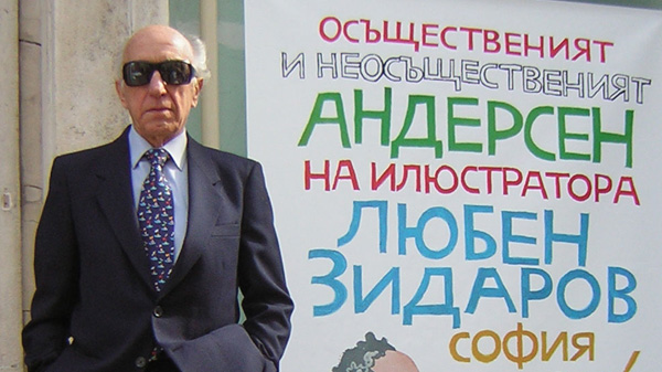
I have illustrated Hans Christian Andersen’s fairy tales four times in different moments of my artistic career; first came the 120 black and white and 16 colour illustrations I did for the two-volume edition printed in 1965. The next two H.C. Andersen editions came out in the course of the next decade and consisted of colour illustrations only, since they were entirely on multicolour offset printing.

By that time I already possessed a considerable professional experience: I had already illustrated more that 50 different authors; but towards this one I turned with great excitement and with the conviction that I had to perform a task of utter importance. I was familiar with Andersen’s fairy tales since my childhood as well as with those of Jacob and Wilhelm Grimm. I had tasted their enchanting charm in an age when imagination has its widest range and can shape the fantastic and the incredible more real than real life.
By the time I was about to start my work I had seen just three illustrated editions of the fairy tales: the one-volume edition printed by the pre-war existing publisher HEMUS, illustrated by an unknown German artist, a second with Jiff Trnka’s illustrations for the Czech translation and the two volume edition of Narodna Kultura Publishing House illustrated by Boris Angeloushev in 1955. The fist one didn’t impress me at all; they were executed in the then fashionable Art Nouveau style, with mysterious purple colours transforming the images in something like ghosts. Trnka’s illustrations were quite a different story. Highly professional, with an outstanding graphic culture and artistic taste, these illustrations had a profound effect on my notions. Even today, after having seen a great number of editions of Andersen’s fairy tales published in different parts of the world, Japan included, I judge Jiri Trnka’s illustrations as some of the best ever done. On the other hand, the back illustrated by Boris Angeloushev was the first qualitative Bulgarian edition. Many of his black-and-white oeuvres were examples of professional mastery, but they could serve equally well the tales of Charles Perrault and to the brothers Grimm. They kind of lacked the quality called “inseparable from the writer’s text”.
So I embarked on my investigations of the subject. First thing I read the fairy tales again in their translation into Bulgarian by Svetoslav Minkov who had edited them as well. I also read the German edition of the Dietrich Verlag in Dresden and I discovered that there was a huge difference from my childhood impressions. After having read them thoroughly I got convinced that these tales were actually written for us adults. I even was able to remember that when I was a kid Grimm’s fairy tales used to give me more pleasure than Andersen’s. I kind of liked “Thumb-high” and “The Seven Ravens” better than “The Beetle Who Went on His Travels” and “The Old Bachelor’s Nightcap”. Now these tales were striking a different cord; what amazed me was their wisdom and deep philosophy they concealed the storyteller’s skill and the phenomenal virtuosity they were told with. They all were steeped in everything that is timeless in mankind’s moral code, expressed in the basic relationships between living things, human and animal alike. When closed the book after having read it twice I expressed my delight to same very close to me (my wife – poet Bogdana Zidarova) saying that I have found the writer extremely appealing, she poured cold water on me with these words: “I have no doubt that you find Andersen appealing but the question is if HE would find YOU appealing!”. That was the first blow. Then the second – the short time I was given by the publisher to finish the work.
But there couldn’t be a turn back; I had already started living with the world of Andersen. So I began to look for an adequate graphic language and character set for the illustrations in black-and-white and in colour. I tried to think of latter-day Andersen: his character not wearing frock-coats and top hats but dressed a la mode of today; women outfitted in elegant gowns and hair-styles, the houses – all glass and aluminium as contemporary architecture looks like. I started with the tale about the young man who yearned to become a poet no other day than Sunday, to get married and to make a good living with his work, but he was blind and deaf for the poetry found in everyday life and was able find out about that only after putting on the glasses of the fortune teller he had asked for advice. From “The Tinder Box” there came out an amusing contemporary science fiction story and “The Emperor’s New Clothes” transformed into a satire of the vanity world of today’s upstarts.
After finishing a couple of illustrations I took a break and returned at my work a few days later. I was shocked. There was no trace of Andersen. There was some other author in his place. He could be any of all the Bulgarian writers whose books I have illustrated but not the one whose oeuvres I was trying to illustrate. This was obviously a dead end. I needed to find a historical exactitude of the fairy tales. So I took up investigating swallow-tailed coats and tophats, laces, gas lamps, flowered wallpapers. Fortunately I had no problem with the wooden houses architecture; I had visited places like Germany, Austria, Czechoslovakia and Poland where there was an abundance of such examples in their original state. To deal with items like stage-coaches and carriage I had to revert to old magazines, encyclopaedias and ancient stamps. I knew that without getting familiar with the necessary requisite nothing would come out. I needed old chairs (period furniture and rural too), beer steins with metal flip tops, Eskimo cabins, a tinderbox, elder twigs, the coat of arts of Denmark, three bulldogs, a military uniform, a dung beetle, a mirror frame etc, etc.

At the height of these feverish investigations my phone started to receive rings from the publisher: the time for research had run out and I needed to get to grips with the essentials – the illustrations. I was aware that an exceeding amount of conserved information could remove me from the author not less than my first ill fated attempt. It would provide for ethnographic accuracy without touching the true poetics of the fairy tales and that happens when you’re moulding your impressions not through firsthand experience but from photo documentation. For developing the drawing scheme I also began to rely more heavily on my imagination up to the level I possess such. I tried out two different approaches: one was using a brush that left a thick line which I graded with a very thin hardly noticeable one that and the second – doing feather drawings. The first approach was easier technically, but it concealed considerable hazards in terms of failing to achieve the correct reproduction of the original. The primitive back printing and the antediluvian level of polygraphy in Bulgaria in those years usually made the thin lines and the undertones disappear making the image blurry or were merging the delicate strokes into unexpected sooty blots. Considering all that, I decided to adept the thin line feather drawing. In this way the outline colour stays unchanged and the line acquires some lyric qualities; it also gives easiness and more detail opportunities. In these drawings I left the type-setting of the page up to where it is cut by the bookbinder’s knife. In this way every tale was beginning with an illustration. That became one of the guiding principles of my illustrations which I follow every time when it is possible. The initial illustration leads the reader directly into the story; it does a better job than a composed title, better even that a designed one; there is an illustrated moment that is already creating curiosity for the tale prior to the actual reading; it works like the overture of an opera whose task is to make us submerge into the setting of the impending events. I spread out the colour illustrations on a full page; then that was the option because the colour pages had to be printed separately on a different type of paper contrasting unpleasantly with the thickness and hue of the text pages.
I was able to register the flaws of this first edition not until it came out of print. Regardless of my efforts there the black and white illustrations didn’t correspond well with the colour compositions. The thin black produced a different shade of feeling from the patches of the colour illustrations and that was key to the very fairy tale nature that I was trying to develop. I was imagining a next edition of H.C. Andersen either in black and white or entirely coloured, more richly illustrated and with a deeper research of the characters resulting in a more thorough knowledge of the North. It didn’t take long to get a commission for that second edition, but this time I decided to take enough time to prepare it right. Further more I was planning a trip to Sweden and Denmark which would provide me with what I had previously lacked: an access to the world of Hans Christian Andersen.
Once there, I had the feeling that all Denmark is a fairy tale written by Andersen. All of a sudden I had found myself among his characters without really looking for them – in the coop of the Ugly Duckling, in the castle of Holger Danske, at the street with the small wooden house of Old Anton of Eisenach. In Andersen’s big travel suitcase exhibited at his museum in Odense I could easily recognize the Flying Trunk. One of the tiny rooms of his house could nicely fit Aunty Toothache and her good-for-nothing poet nephew. I was able to find the colour set of the fairy tales in the outlook of the houses: same of them in red bricks, others whitewashed and in their beams and joists painted brown, green, yellow or vermilion.
It looked as if my work was only starting. I completely dropped the idea of reworking the first edition illustrations because I could see now that it kept a rather distant relationship with the writer’s country. I considered this circumstance as a major flaw although that shouldn’t be something unnatural. By all means the tales were illustrated by an artist who wasn’t Danish but Bulgarian. If you open a Japanese edition of H.C. Andersen you would see that the human characters are Japanese men and women; a Japanese farmer holding the Ugly Duckling in his hands with Danish wooden farmhouses in the distance. Every foreign edition was carrying some bigger or smaller digression from what I considered the essentials.
Notwithstanding, being under the impression of my Nordic experiences I began work on the new illustrations with the only aim to carry the reader to Denmark. The entirely multicolour print of the edition provided for new book design and page settings. I did not include anything that I hadn’t seen in its natural environment; the graphic language didn’t interest me any more, I was totally fixed on the author and his world.
The illustrations of that edition brought back a number of rewards: Gold Medal from the Leipziger Buchmesse, the Bulgarian Artists’ Association’s Boris Angeloushev Award for Illustration, the H.C. Andersen Honorary Diploma from Athens, the Slaviana Prize.
Years have passed since then. A lot of other authors entered my creative work – established classics and contemporary – but Andersen was always on my mind, inspiring me even without looking at the award-bringing illustrations, because quite soon I felt that my task to carry the reader all the way to Denmark was not a completely successful venture. I envied artists who had made it to add a piece of them to the rich world of Andersen, while I was dangling between my thatched roof houses and golden buttoned frock-coats.

With this last, fourth edition I made a quite different effort; I disregarded the exact stage-set and I tried to make use of everything that I had learned so far as a professional book illustrator. I was already close to the author’s own age, although I was still quite far away from his wisdom. But it seemed to me that I could see the multicoloured kaleidoscope of human virtues and vices as seen through the eyes of Andersen; therefore I consciously eliminated from the composition and the details everything that would stand in the way of reaching the psychological substance of the fairy tales. In other words, I redid every character – human and animal alike.
Beyond doubt, the time distance will be the best judge ruling whether the last illustrations were really the best ones or if, no matter the professional skill, they still lacked the romance of youth’s awkwardness.
What is going on in the workshop of an illustrator usually is of little concern to the reader. Hardly anybody would give that much attention to the fact that the writer might be endlessly rewriting his oeuvre or the artist would throw out his work in the waste-paper basket if not content with the result. Readers are not interested in what the illustrator was looking for, rather in what he has really found. But finding the author of the literature in one’s own creative work cohabitating with the text and attaining the same potential to lead the reader’s imagination that remains the highest reward for any artist illustrator.